Beginner’s Guide to Trading Chart Types: Basics, Candlestick, and 3LPB
Understand the differences between basic charts, candlestick charts, and 3LPB to gain a competitive edge in trading.
Basic Charts
Technical Analysis is the study of price and trend changes in Commodities, Stocks, Futures and various other market instruments. The price changes are primarily evaluated by various indicators, oscillators or trading systems to give a trader an edge in trading. Technical analysis is not a perfect science by any means, but it does have certain characteristics, patterns or indications which may be repetitive or may be intuitive and tend to possess Zen-like predictability power. Technicians plot these prices and price changes on a chart and apply various indicators and studies to figure out potential supply and demand areas, trade setups, targets and stops to win.
Technicians have developed various methods of representing market data on charts. The most extensively used charts are bar charts, line charts, candlestick charts and point & figure charts. There are many other variations like Kagi, Renko and Range bar charts. In this section, I will attempt to address the basic charts and their usage.
The most basic charts in technical analysis follow simple Cartesian structure (X&Y axes) to draw in 2-Dimensional space. On the X-axis (Horizontal), the time is plotted and on the Y-axis (vertical) the corresponding price is plotted. Any indicators derived from the time and price values, are either overlaid on the chart itself or plotted in secondary-graphs below and above the main priceltime chart. Some traders plot volume on the X-axis as a representation of market activity.
Charts are plotted using various scales such as arithmetic or log /semi log charts. Arithmetic charts have the same distance between the prices where as log or semi log charts have a variable distance to represent the proportionate price movements.
There are many facets in technical or chart analysis to understand and master. Price, Volume, and Time are the three most basic components of the market. Many successful traders only study price action to make money. Many other traders use complex mathematical theories and faster computer technologies to analyze and participate in the market action. Nevertheless, regardless of any trading theory or complex mathematical algorithm, the success in the markets lies with individual who can clearly understand the price-action and make the decisions to pull the trigger at the right time with excellent discipline. These individuals possess a higher understanding of market theories, market psychology and dynamics and money management methods and have mastered their execution skills.
Charts, patterns, indicators and software are only basic market tools. Successful traders view them just as tools and understand the usage. They build a theory and trade with a solid money management plan.
Basic Chart Types
Bar Charts
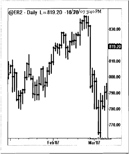
Bar chart illustration is simple. Within each time-frame, a single vertical bar is plotted representing the price range within that time-frame. Each bar may have a left tick showing an Opening Price and a right tick showing a Closing Price. The top of the bar is the highest price reached within that time-frame and the low of the bar is the lowest price reached within that time-frame. The time-frame can be 1 tick, 1 minute, 1 day, 3-days, 1 week, 1 month or 3-months, or any finite numbers to represent time. The relationship between the Opening Price (left tick) and the Closing Price (right tick) represent the investor’s sentiment and the trader’s psychology within the trading session.
Line Charts
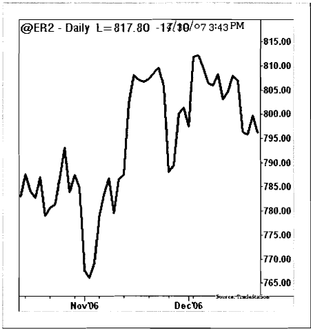
Line charts are based on “closing prices” only charts and have a cleaner look. They do not have open, high and low values plotted and potentially eliminate the noise and truly represent the value of the current price and true investor sentiment. Line charts can be plotted for highs, lows and open or pivot prices, but are only plotted for a single value object series in the entire chart. Line charts are usually plotted when there is a comparison between two market instruments such as spread charts, comparison charts and relative strength charts. Also, line charts are useful for small illustrations and trend displays. Most indicators are plotted using line charts, namely RSI and Stochastics.
Candlestick Charts
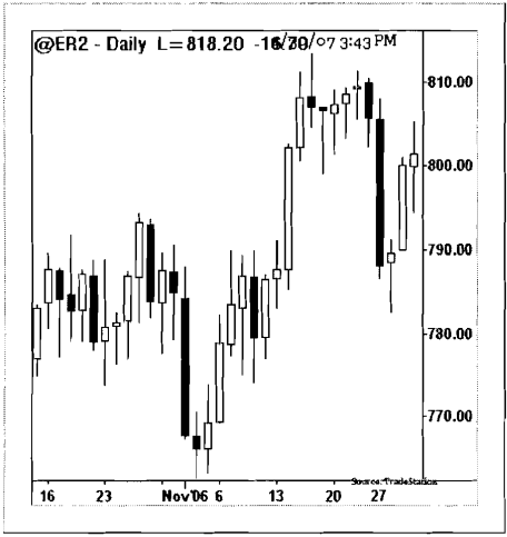
Candlestick charts were devised by Japanese rice traders in the 1600s and are discussed in detail in the next chapter. Candlestick charts are built on the open to close price relationships. The real-body is represented by the range between open to close and the color of the candle is black if the price closed below the opening price and white if the price closed above the opening price. The “wicks” on the both ends of candlestick represent the trading sentiment before settlement. Candlesticks have various patterns and truly represent supply and demand. Traders use candlestick charts with other market indicators such as moving averages, trend lines and RSI etc., to find the better opportunities than western charting methods such as bar and line charts.
Point and Figure Charts
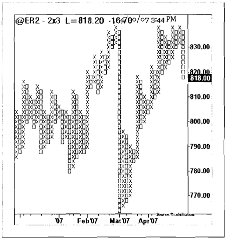
The Point & Figure (P&F) charting technique is one of the oldest methods where the chart represents a true change (a box size) in price. In P&F charts, the time passage on the X-axis is ignored as the chart records the price change. P&F Charts have Xs and 0 s representing ascent and descent of a fixed box size price change. Each box size is pre-set and the price is represented only if the price trades above or below the previous box by that amount. The P&F method visually displays clear support and resistance levels. Trades are initiated from these levels on breakouts and breakdowns. Charts do not move in congestion range, hence choppy trading can be avoided. Box sizes can be a function of price range, average true range or a fixed size based on the closing prices.
Candlestick Charts
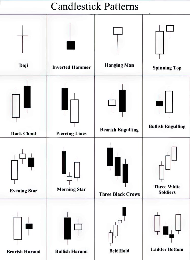
Japanese rice traders invented Candlestick charting methods in the 1600’s. “Candlesticks” show a visual representation of traders’ emotions; where as “bar” charts or “western” charts emphasize a focused approach on closing prices. Candlestick charts have a real-body (Open to Close) and shadows (Upper, Lower) showing intra-bar price relations between the key price values. In Candlestick charts, if a price closes higher than the open price then the Candlestick would be plotted Green suggesting bullish, and if the price closes lower than the open, the Candlestick would be Red, suggesting a bearish condition. The market sentiment is measured by the “real-body” length and its color. The bigger the real-body the bigger the sentiment and the smaller the real-body the smaller the sentiment which conveys indecision.
Candlestick charts offer a unique advantage over bar charts or line charts since they offer an excellent visual representation of the relationships with prior Candlestick bars. This indicates supply and demand along with the support and resistance levels, and possible trade decision opportunities for trend continuation or reversals.
Candlestick charts offer a simple way to show market movements and present outstanding trading opportunities. There are about 30-40 Candlestick patterns, continuation and reversals, which are helpful in trading. However, these patterns need to be clearly understood and mastered for successful trading purposes. The theory behind Candlestick charting method is not infallible. All patterns have clear confirmation theories and trading rules. The charts demand a full understanding of knowledge of pattern formations for successful trading. There are many books written on Candlestick patterns and theories. Below are a few examples of trading Candlestick patterns.
Trading Candlestick Charts
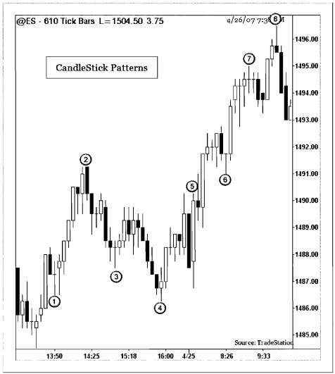
The chart above illustrates various Candlestick patterns from the S&P 500 Futures 610 tick chart. Various Candlestick patterns have been marked in the chart above and explained as follows:
- A Doji pattern to suggest indecision in the prior direction.
- A Dark Cloud to signal a potential end of trend. (Also see Hammer pattern prior to the Dark Cloud).
- Another Doji to signal indecision.
- A Piercing line followed by a strong trend reversal bar.
- A Bullish Engulfing pattern to confirm a strong trend ahead.
- A Gravestone Doji.
- A Doji bar to suggest an imminent trend reversal in the next few bars.
- An inverted Hammer at the top to signal the end of uptrend and strong downtrend to follow.
Three Line Price Break Charts (3LPB)
Three Line Price Break (3LPB) charts define the underlying trend and are considered as an adjunct to the candlestick charts. 3LPB charts display a series of vertical boxes or candles that are based on price changes. The 3LPB method entirely dispenses with the recording of the volume sales and time data on the X-Axis. The other major charting techniques like Point & Figure, Kagi and Renko charts also ignore the passage of time and volume.
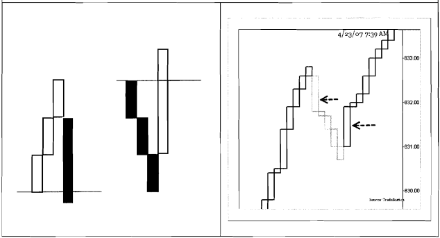
The 3LPB are always constructed based on closing prices. A basic understanding of 3LPB is when there are three white successive candles, the major trend is up, and when there are three successive black candles, the major trend is down. The major reversal signals (based on the 3LPB technique) are given when the shift lines, white to black or black to white are formed. After forming a confirmed trend of 3 white candles or 3 black candles, the reversal is only triggered if the current price is traded below the lowest of all prior three candles in case of a bullish trend reversal, or if the current price is traded above the highest of all prior three candles in case of the bearish reversal.
Trading with 3LPB
The 3LPB charts below show major trend changes. A trend change confirmation is made when a reversal bar is formed. However, a trend confirmation bar could be late and a significant move to the upside or downside may have already happened. A solution for this problem could be an intra-day trading signal for confirmation of the trend. The 3LPB charts also use other indicators and pattern formations to indicate price trends. The best trade signals are generated when the market reverses near the key support and resistance levels.
Trading with 3LPB
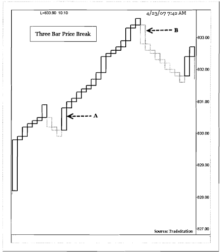
The chart above shows an example of a 3LPB pattern from the Russell 2000 E-Mini one-minute chart. Candle A shows a Three Line Price Break reversal to the upside from the previous trend as the price closed above the high of the three candles. A “long” entry is placed at 83 1 level. A stop order is placed at the low of this breakout candle at 830. Targets are either taken with a reversal candle or at a pre-set target limit. One of the best techniques to place a target is to take the length of the reversal bar and use 2 times the length of the bar as the target. At candle B, a 3-Bar reversal candle is formed to enter a “short” position below the low of candle B. A “stop” order is placed above the high of Candle B. A target of twice the length of the candle is placed below the entry level.
Trading 3LPB with Triangle Formation
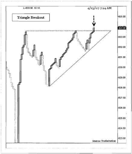
The chart above shows a Three Line Price Break chart from the Russell Emini one-minute chart. The chart shows an ascending triangle pattern formation as the upper trend line was tested three times. The price closing outside the upper trend line signals a potential long trade.
- Enter a “long” trade above the high of the breakout bar.
- Place a “stop” order below the low of the breakout candle.
- In an “Ascending triangle” pattern trade setup, the depth of the triangle is added to the breakout level for a target.
